
A full redesign and rebuild of the client’s website in plain HTML, working within design requirements and requested narrow scope of work.
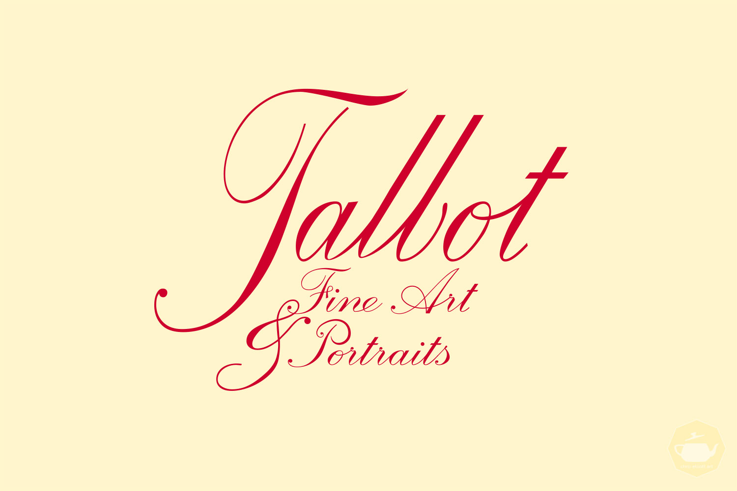
The artist also commissioned an update to their logotype. Working from the previous logo, I was limited to the Palace Script MT font, which presented legibility concerns on smaller screens. I countered this by rearranging the logo to allow for larger font on the subheader, reworking many of the letterforms to be more legible, and loosening up the connections between letters to feel more hand-written and natural.
Portrait images included are ©Susan Talbot-Elliott.


Social Media